From Grayscale to Greatness - Why Values Come First
Why starting in grayscale builds stronger compositions and how value control drives all visual design.
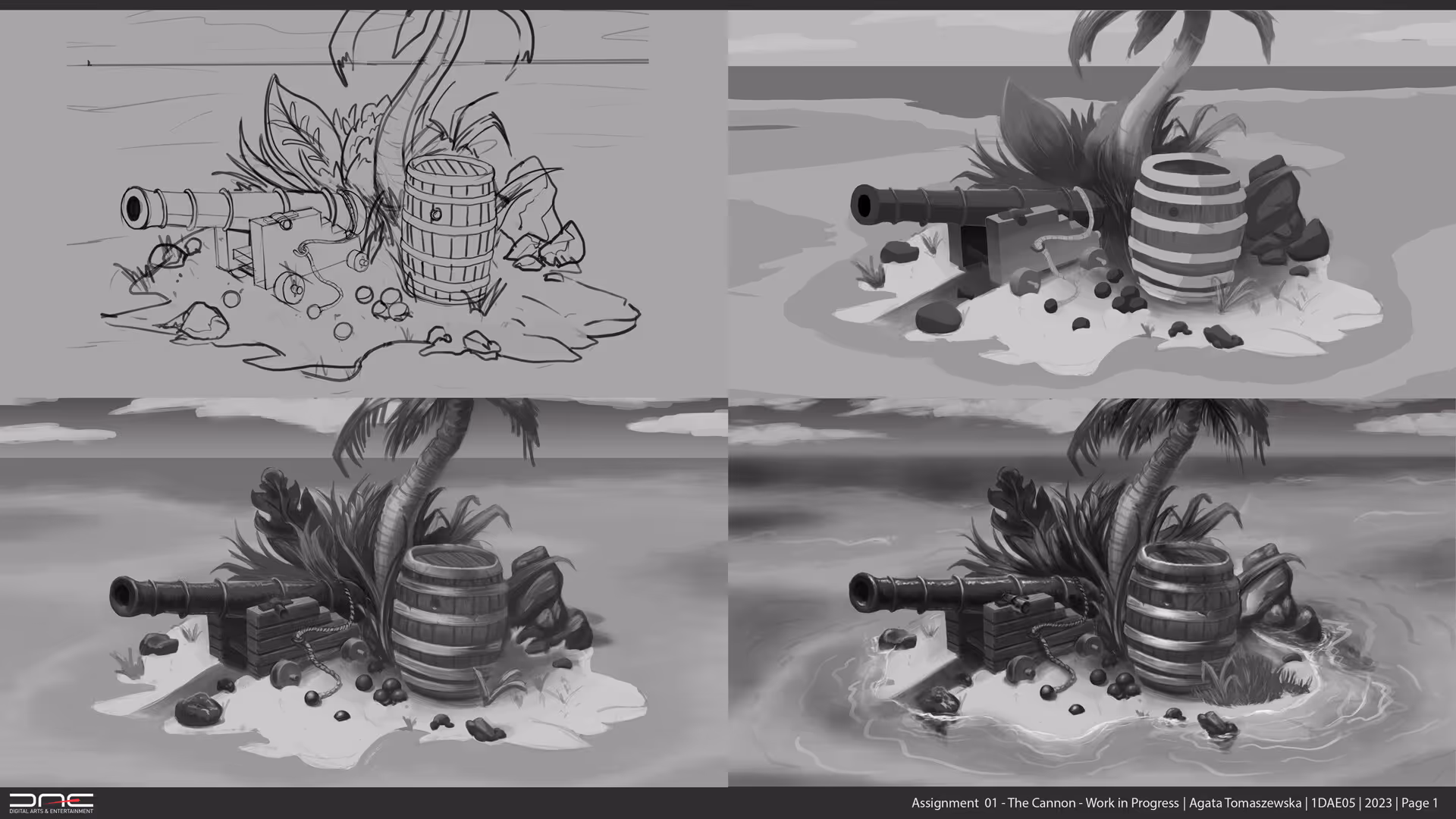
1. Value Before Everything
Before color, there’s value.
Before texture, there’s light.
Every strong image begins with grayscale clarity.
Working in grayscale strips away complexity and reveals what really matters - the structure of the scene.
2. Building with Light, Not Hue
Painting without color forces you to think in terms of:
- contrast
- focal points
- silhouette clarity
- light direction
- shape readability
It’s where the composition is truly decided.
If the grayscale works, the final piece works.
If it doesn’t, no amount of color can fix it.
3. Value Hierarchy = Stability
When I shifted my grayscale painting into color, I realized the entire image held together because the value hierarchy was already balanced.
Strong values carry:
- mood
- depth
- rhythm
- storytelling
- readability
Color simply rides on top of the structure you already built.
4. The Secret Behind Professional Work
Professionals don’t start with color because color is too forgiving.
You can hide weak decisions behind saturation or hue shifts.
Value doesn’t let you hide.
It exposes the truth of the composition - and once that foundation is solid, adding color becomes effortless, even fun.
Master values first, and everything else becomes play.