Overview
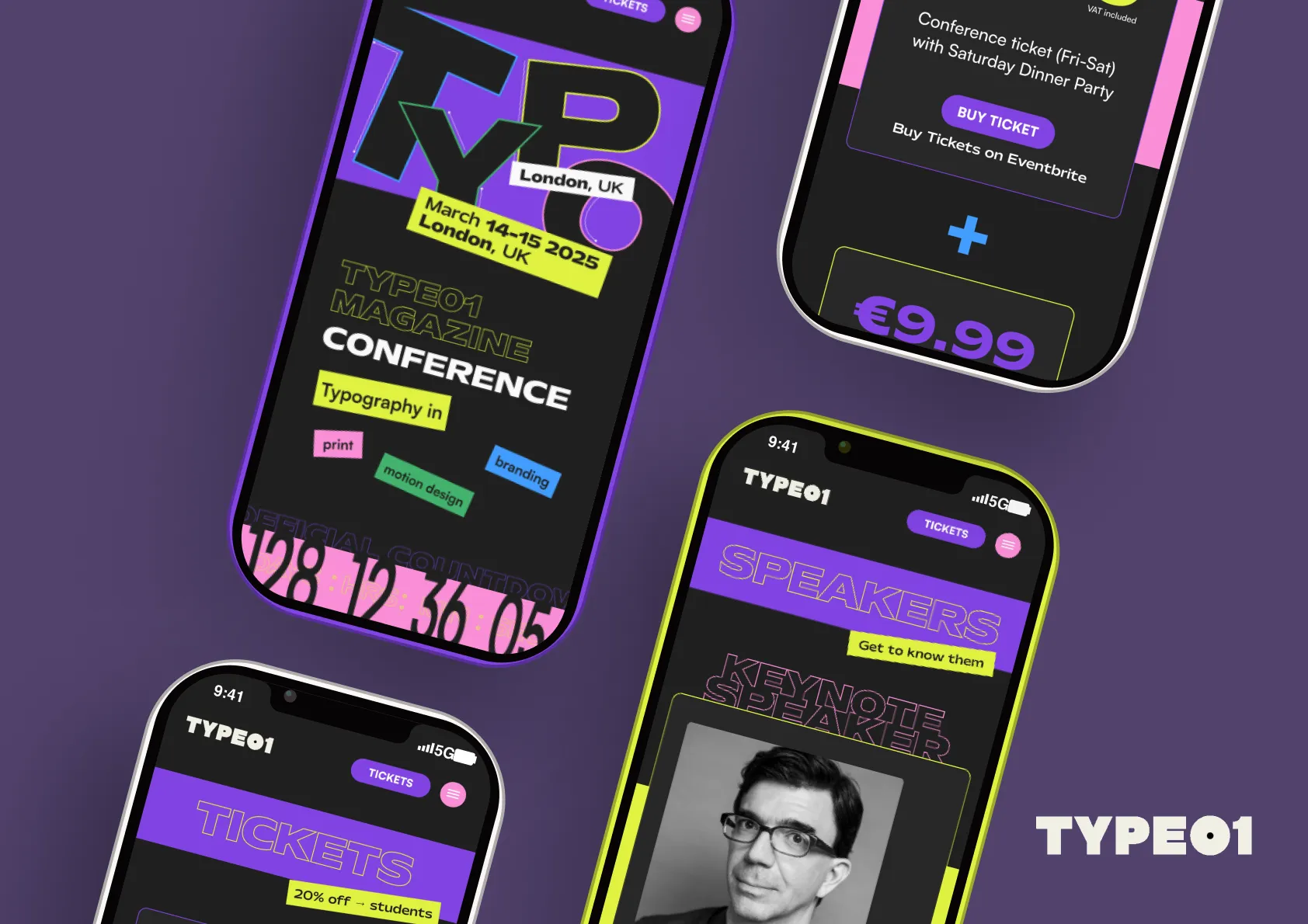
TYPE01 Conference is a responsive website concept for a typography-focused design event in London.
The goal was to create a digital experience that felt as expressive as the conference itself while still making practical information — speakers, schedule, tickets and event details — easy to find.
The design was created for both desktop and mobile, with the same visual identity adapted across different screen sizes.

Visual direction
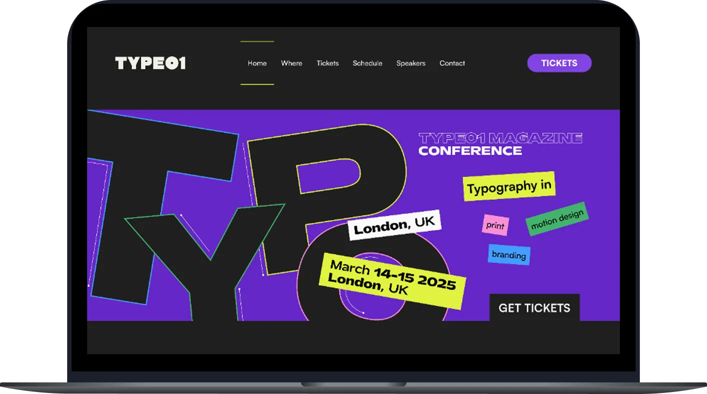
Because the event is centred around typography, I wanted type to become the main visual element rather than simply supporting the layout.
The interface combines:
- oversized typography
- outlined and layered letterforms
- bright accent colors
- sticker-like labels
- strong contrast against a dark background
The result is intentionally energetic and slightly chaotic, while still using a clear underlying grid to keep the content readable.
Event experience
The website brings the main parts of the conference into one system:
- event introduction
- countdown
- schedule
- speakers
- partners
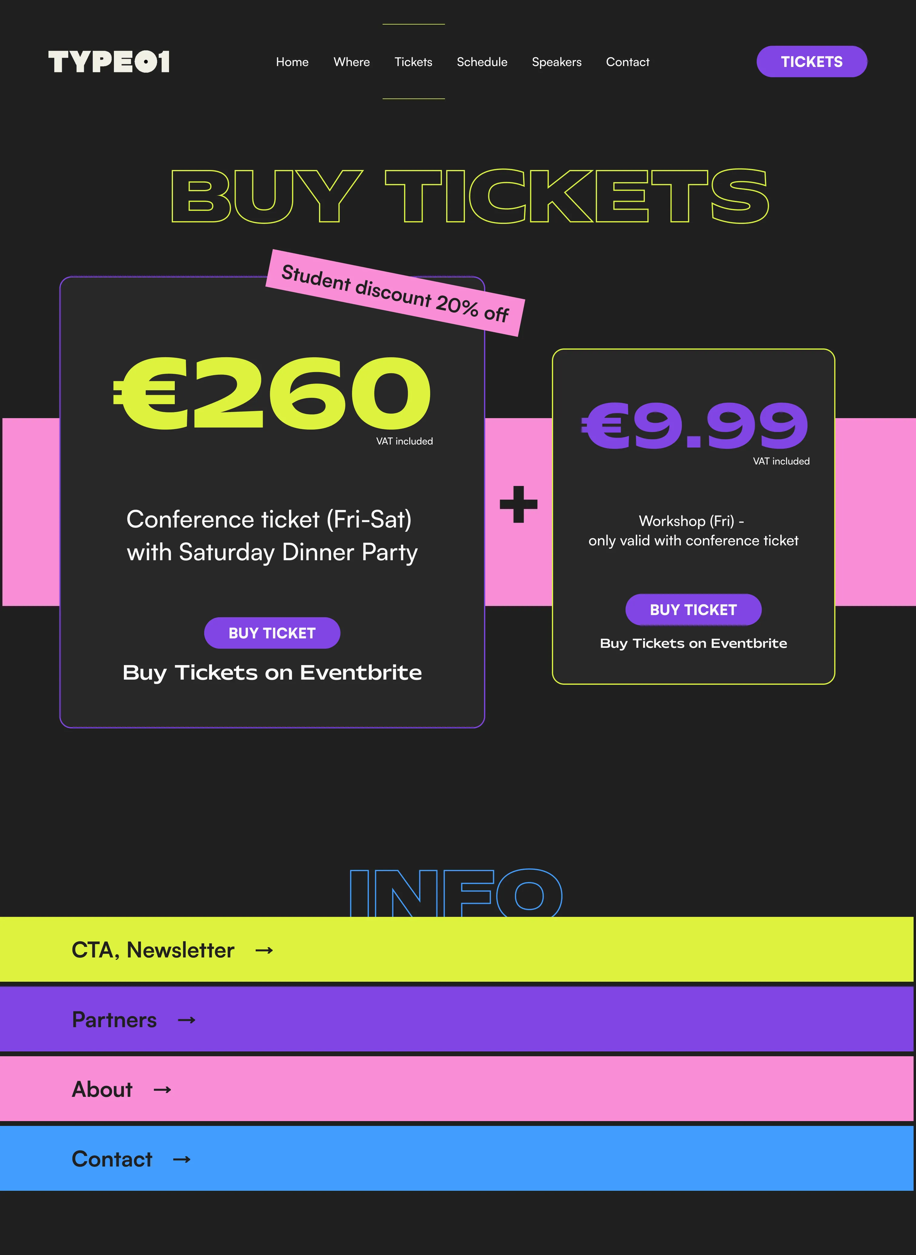
- ticket purchasing
- event information
Large typographic sections create visual moments between more functional content, helping the page feel like part of the event identity rather than a generic conference website.
Responsive design
A major part of the project was translating the desktop design into a mobile experience.
Rather than simply shrinking the original layouts, I adjusted hierarchy, navigation and composition to work with the narrower format while preserving the oversized typography and bold visual language.
The mobile version keeps the same personality while making important actions such as Tickets, Speakers and the event schedule easy to access.
Outcome
TYPE01 became an exercise in balancing expressive typography with functional interface design.
The project helped me explore how a strong visual identity can remain consistent across desktop and mobile without sacrificing usability or hierarchy.