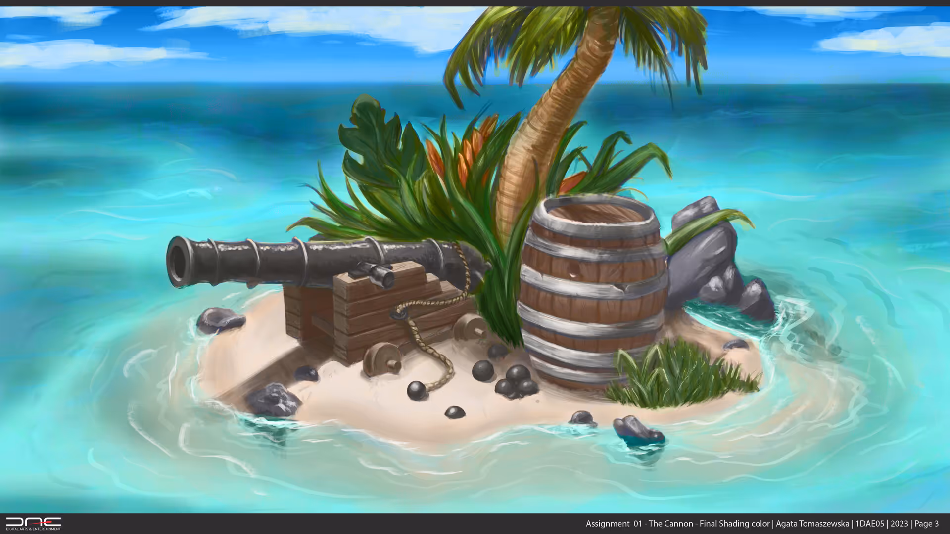
Cannon Island
View Full Project on ArtStation
Concept
This project was part of my Pre-Production course at DAE, focused on understanding color theory and value balance.
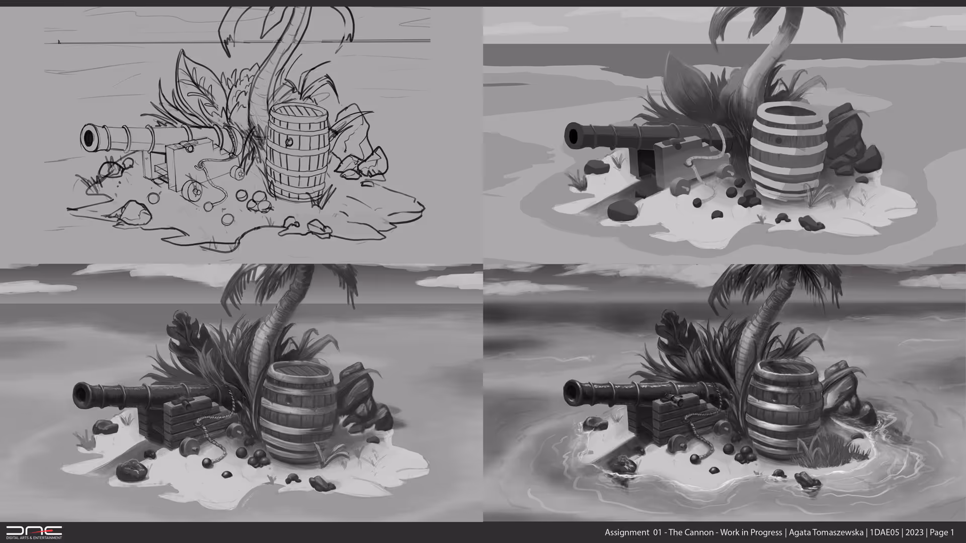
The exercise began in grayscale, where the challenge was to define a strong value structure before applying color.
Once the composition worked tonally, I translated the same piece into color - matching values to maintain harmony and contrast.
The goal was to prove that strong values create strong images, no matter what colors are used later.
Process
The project started as a grayscale study, built entirely around light and shadow hierarchy.
I analyzed how each shape contributed to the overall depth and composition, ensuring the image worked even without color.
Workflow:
- Grayscale blocking: established clear light and dark areas to define form and atmosphere
- Value check: ensured readable contrast between focal points and background
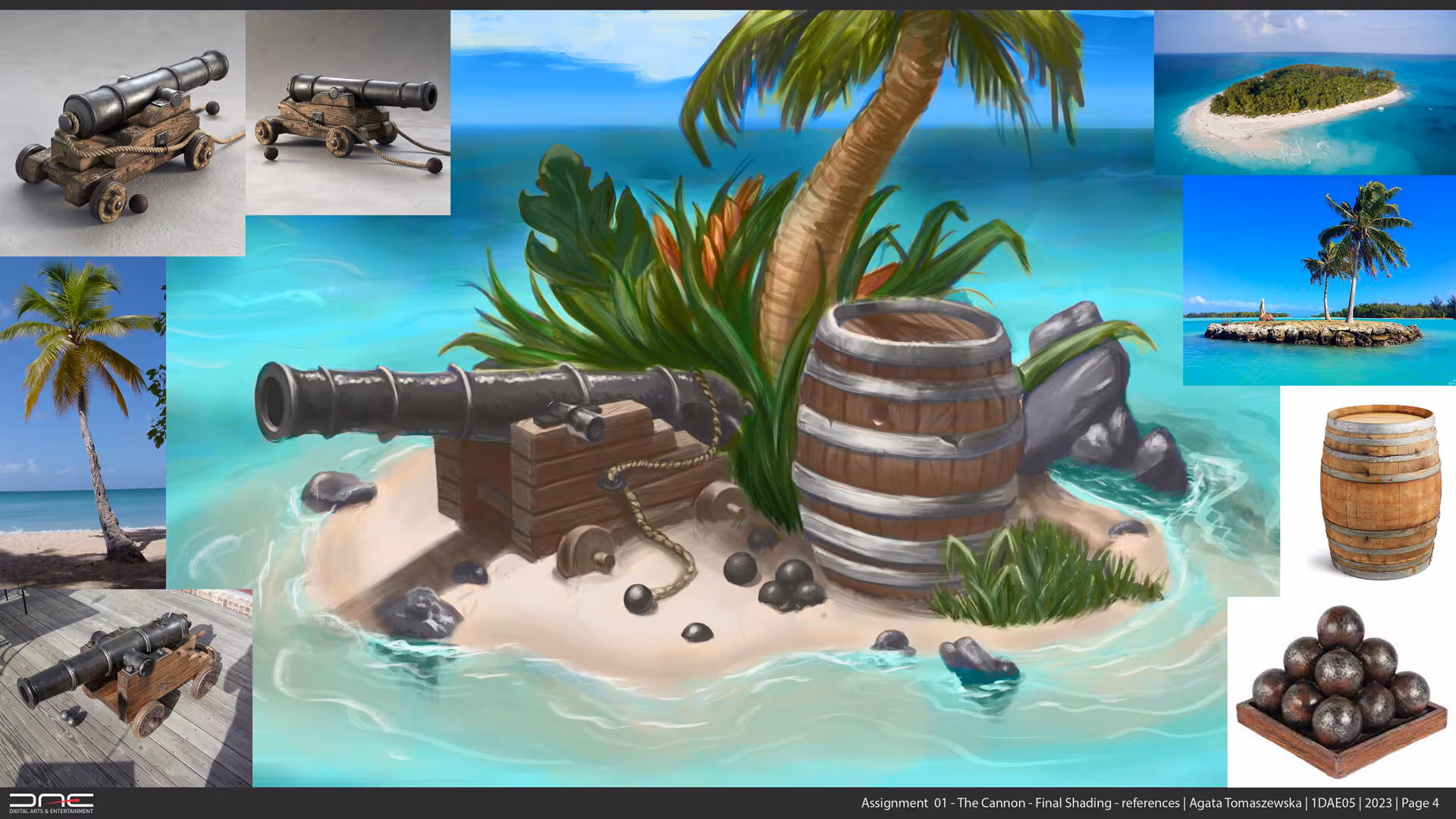
- Color translation: carefully layered color using digital painting techniques while preserving grayscale values
- Color adjustment: balanced saturation and temperature shifts to maintain depth without losing harmony
- Final touches: refined edges, highlights, and ambient tones for a cohesive finish
Throughout the process, the grayscale version acted as a blueprint - keeping the color composition grounded in structure.
Outcome
The final painting maintains a consistent value hierarchy while introducing color harmony and mood.
Even though the hues vary, the light–dark relationships remain identical, resulting in a balanced and readable image.
This project demonstrates how mastering values first is the foundation for believable, controlled color work.
View Full Project on ArtStation
Reflection
This study deepened my understanding of color theory and visual hierarchy.
I learned that color alone doesn’t make an image work - values define structure, and color only enhances it.
It also trained my eye to compare saturation, temperature, and brightness to maintain a unified feel across the image.
It was a valuable reminder that in both drawing and 3D, value relationships drive realism and emotion - color simply brings them to life.